I spent all this time finding out the right way to pronounce Eyjafjallajökull, so I’m secretly glad that it’s continuing to stay topical and erupt. Here, I spotted this very pretty time-lapse video on Gizmodo of billowing ash clouds rolling skyward and toward the jet engines of Europe. Enjoy.
There’s been some pretty ridiculous rhetoric this morning from the Libs who’ve claimed that Kevin had a blow-up on the 7:30 Report last night akin to something Latham might’ve produced. Please! What a load of rot. Here’s Kev (thanks JJ – Daily Bludge for uploading the clip):
Let’s compare that with a proper blow up, shall we? Check out Bob’s effort (courtesy of Bernard Keane on Twitter):
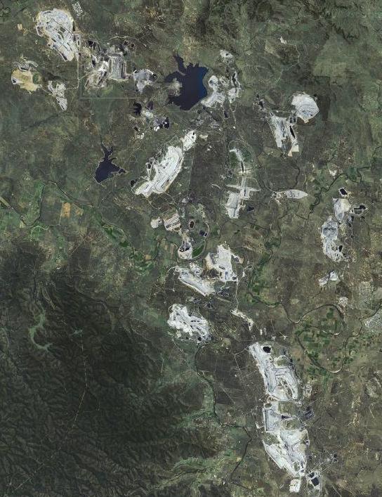
Let’s dig until it’s deeper! I saw a documentary on the ABC a few weeks ago about how residents of the Hunter Valley were concerned about how dust from nearby coal mines might be affecting their health. There were a few aerial shots which showed just how much of the Hunter Valley is currently being dug up. Here, I took some screenshots from Google Maps to illustrate the same thing:
This shot shows all the mines in the Hunter
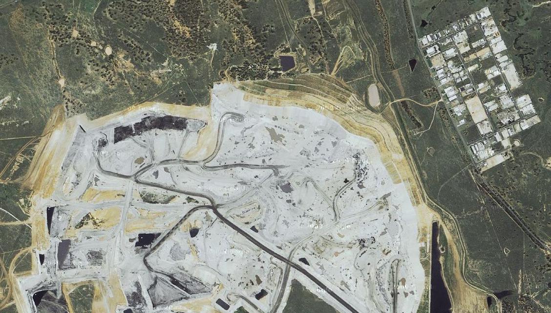
It’s a bit hard to get a sense of scale from this shot though; those mines are really, really freaking huge. See that medium-sized one on the upper left? Here’s a zoomed in shot which gives you a sense of scale. Look at the size of the buildings, or the trees compared to this upper section of the mine. Click the image for full-size.
The upper third of that mine. Click to enlarge.
The majority of Australia’s coal is found in NSW. The Australian Coal Industry estimates that Australia has another 180 years worth of identified reserves at today’s rate of consumption. Quite apart from what will be done with all the carbon dioxide produced by burning that coal, what’s our landscape going to look like in another 100 years?
Bloody hell. And some 85% of our power is produced by burning this stuff. I’ve gotta say, electricity windfarms are pretty ugly but … so are massive open cut coal mines.
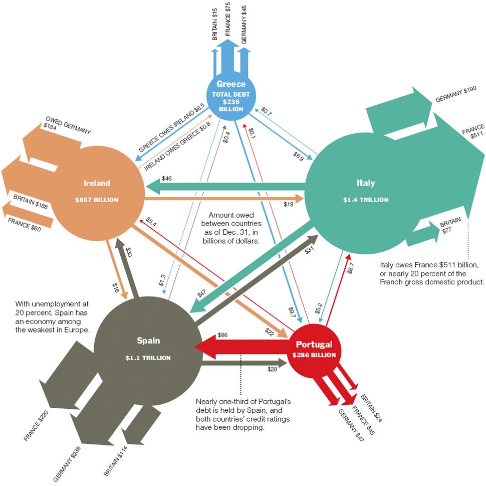
You may have seen this already, but courtesy of the New York Times: A spiffy graphic illustrating the colossal debt position of Portugal, Ireleand, Italy, Greece and Spain. It’s worth noting that the UK has a national debt of around £952 billion (or around US$1.42 trillion), so somewhere around the same level as Italy. That figure represents around 53% of British GDP, while Italy’s figure represents a proportion just less than twice that. Click for full-size.
I’m not sure that it’s possible to come up with a more politically inflammatory trailer than this one for the US immigration nutters. I’m led to believe that the entire membership of free republic are loading their weapons as we speak.